Redesign Help Center Mobile Experience
PNC’s Help Center was failing 10M+ monthly app users as a critical touchpoint for one of the top 10 banks in the U.S. Users discovering fraud or needing urgent support were getting lost in unclear icons, inaccessible features, and dead-end flows. I led research and redesign of the Locator and Request a Call flows, partnering with a Product Manager, Researcher, Developer, and Content Designer.
Key Solution
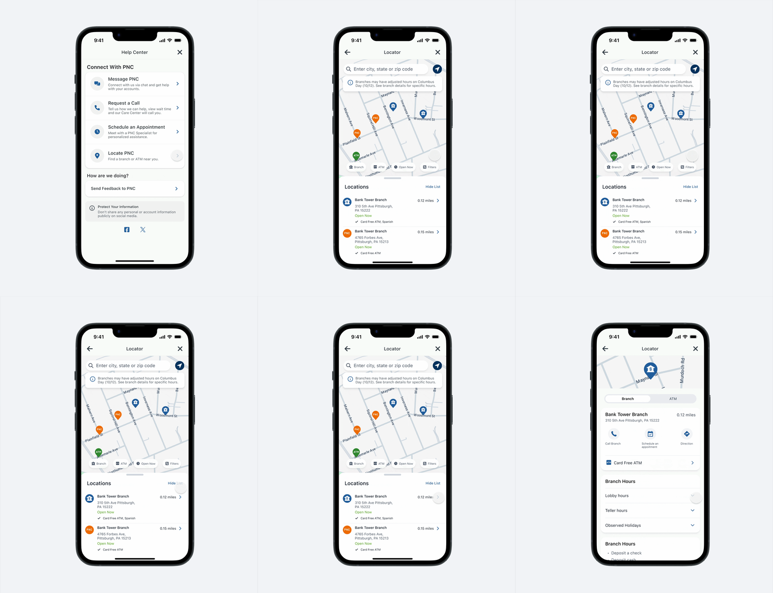
Locator
A Locator with accessible, distinct icons replacing ambiguous color-only differentiation, breadcrumbs for orientation, and filters repositioned for lower cognitive load
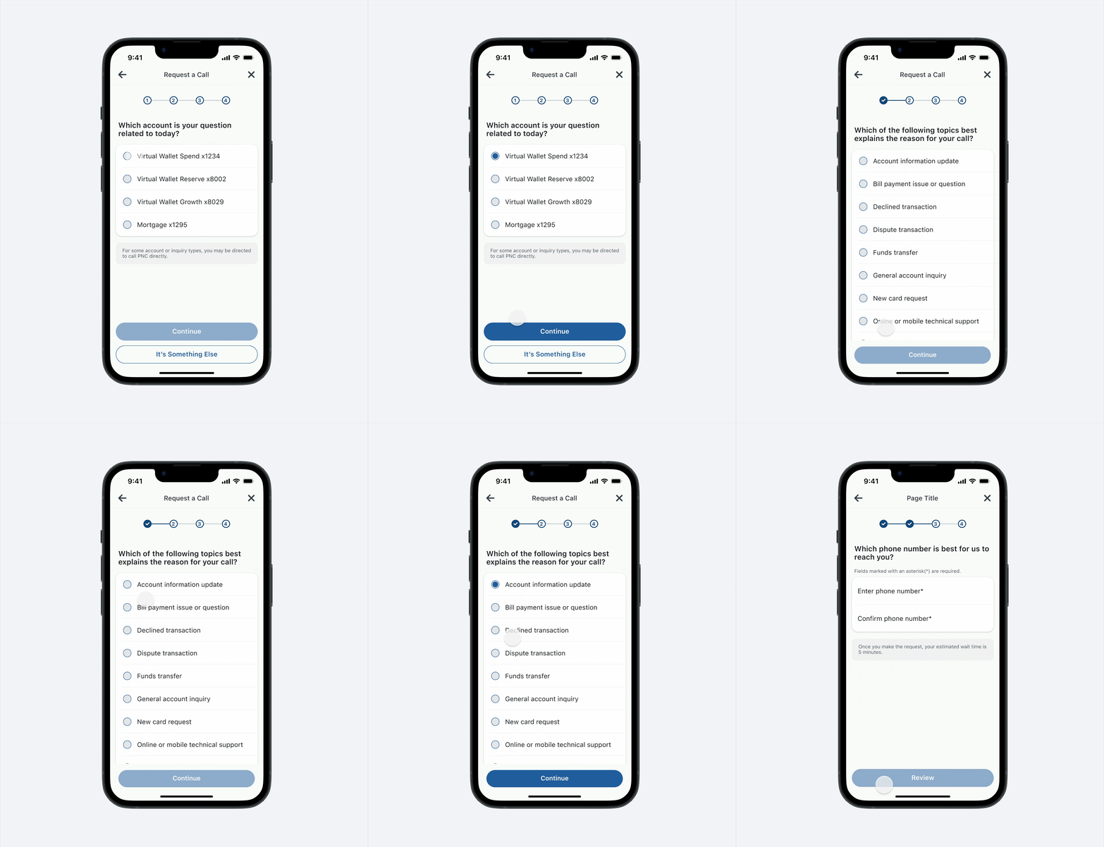
Request a Call flow
A Request a Call flow restructured to route all account types (not just personal banking) to the correct helpline, with simplified language and clearer page hierarchy.
The Problem
App reviews and call center data showed users struggling to find branch details or request a callback, driving live support costs up and satisfaction scores down. The numbers made the stakes clear:
Low Completion Rate
Locator flow completion rate is only 60%; Request a Call completion rate is 56%
Risk of increasing cost
Projected 27% increase in live support costs by Q4 2025 if left unaddressed
Low NPS
Locator NPS: 6/10; Request a Call NPS: 6.5/10 (detractor range)

Outcomes & Impact
Locator Flow
- 89%Task completionOutperforms goal
- 1sReach location detailUsers now reach location details in under 1 second
- 7.5NPS ScoreNPS improved from 6 to 7.5
Request a Call Flow
- 89%Task completionOutperforms goal
- 13%Reduced costUsers self-serve in the app
- 8.0NPS ScoreNPS improved from 6 to 8
Design & Research Process
During user interview sessions, I partnered with Product Manager Frank and Researcher Drew to pinpoint exactly where and why users were getting stuck in location details or request a callback. I compiled key observations and user quotes into thematic groups, with two recurring sentiments emerging.

Challenge one: Users struggled to access the location details page because locator features were hidden and scattered
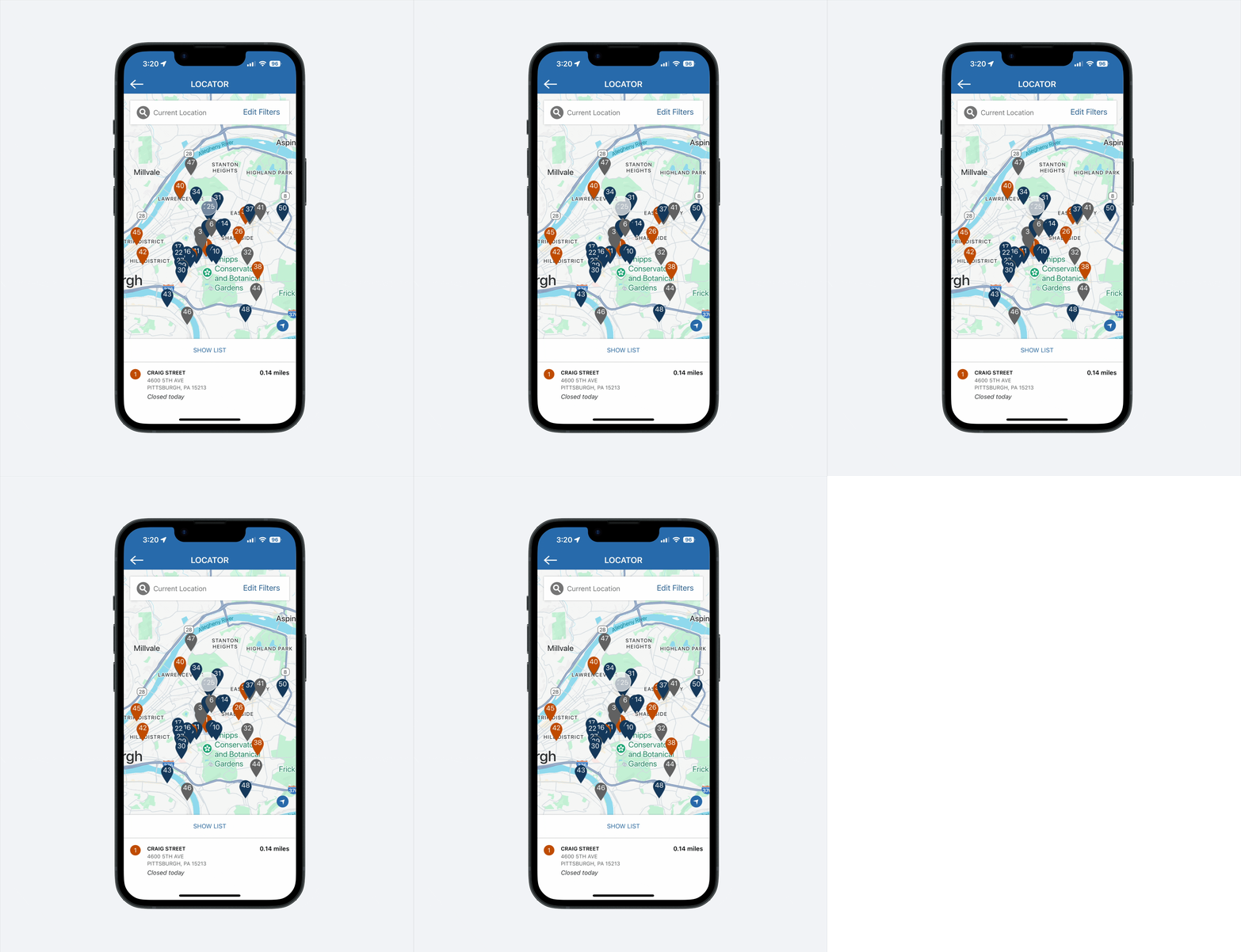
Icons lead to confusion
Users assumed colorful icons were interactive, then abandoned the flow when they weren't. Our decision was to replace the old icons with accessible pictorial + word-mark icons, validated with the accessibility team.
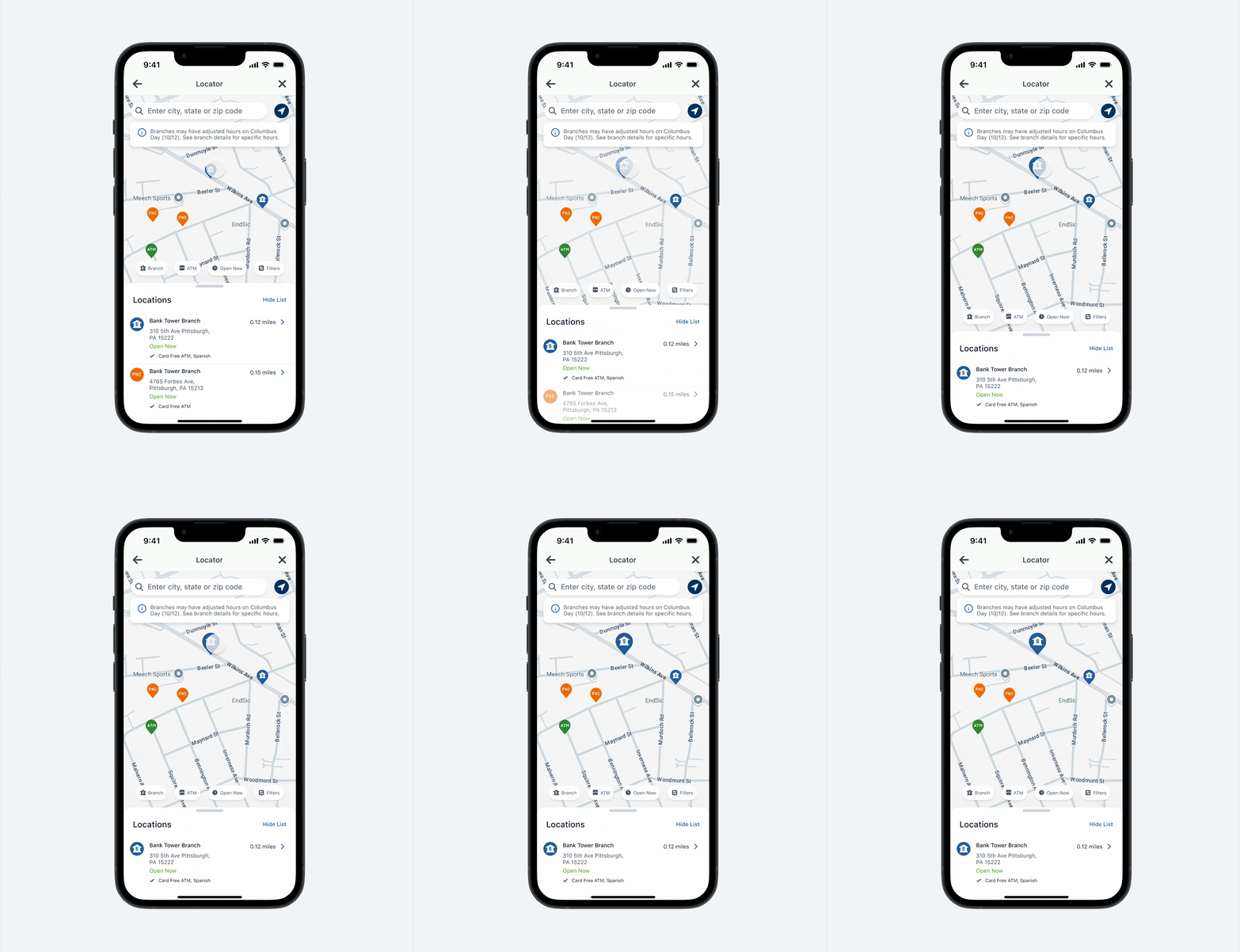
Duo entry points lead to confusion
Users felt overwhelmed by dual interactions on the small search bar and often experienced fat-fingering issues, which, as confirmed by PNC's accessibility coach, also failed to meet the bank's WCAG triple A standard. To reduce interaction and cognitive load, I separated the filters from the search bar. After exploring placement options and accounting for top notifications, I positioned the filters at the bottom.


Challenge Two: The 'Request a Call' flow only supported personal banking accounts, with ambiguous labels and poorly structured pages that confused users.
Enhancing the request a call work flow
Knowing the flow worked for supported accounts, but failed for 46% of users, I worked with Product Owner Frank and developer Divya to inventory unsupported accounts and their specific phone numbers.

6 Minutes Saved
Users can now be routed to the right helpline, which saves them an average of 6 minutes.

Building visual consistency and clear content
Besides, looking at the overall experience, the flow had redundant, unclear content and confusing grouping of information, so I partnered with content designer Jenny to simplify language, unify content standards, and ensure users clearly understand each button and choice.

Restructuring for Clarity
Since Help Center features are self-explanatory, we removed redundant top text and subtext to keep focus on the main message. For the sake of time, not going to mention some other feature level changes on this page.

Aligning IA with how users actually think.
Additionally, we restructured the page IA by moving generic inquiry selection to a secondary action, aligning with users' mental models, clarifying progress, and reducing uncertainty.

Other Contribution
Accessibility as a lasting standard, not a checkbox.
Collaborated with PNC's accessibility coach to bring the Locator and icon system up to WCAG AAA standards — work that later informed accessibility practices beyond this project.

Lessons Learned / Next Steps
Support is foundational to how users feel about their bank, especially when they’re vulnerable (e.g., fraud). Key takeaways: interfaces should guide through smart defaults rather than explanation; plain language matters most in high-stakes moments; accessibility is core to trust, not optional. Looking ahead, I’m exploring agent AI (conversational support) to make help faster and more adaptive, because good product design means respecting users’ time and intelligence, especially when money is on the line.